

For both B2B and B2C brands, social media marketing has become an age-old tactic by now. And it’s no surprise. Despite working 8 hours a day and sleeping (hopefully) 8 hours, the average person still spends nearly two hours each day on social media, according to a study by Mediakix.
But the social media landscape is changing—alot. Organic reach on Facebook is declining with changes to the Newsfeed, some of which are still rolling out. Twitter is struggling to retain their active users. Instagram is experimenting with long-form video content. LinkedIn is also investing in more video.
Given these changes and regular updates, the best practices for each platform are constantly evolving. But what’s one thing that isn’t poised to change anytime soon? The importance of using eye-catching, compelling visual content to draw people in.
Whether it’s YouTube, Snapchat, LinkedIn, or another social media platform, we know audiences consume content on those channels for a significant amount of time—they crave it. And if you want to make a positive impression, you have to go beyond ensuring proper image dimensions. You need make sure you’re sharing the right visual content on the right platform.
 To help you paint your content in the best light on social media and help create a positive experience for your audience, we asked our own Social Strategist, Meg McDougall, to share some best practices for selecting the right social images and video for some of the major platforms. Here’s what she had to say.
LinkedIn Social Image and Video Best Practices
Think About Your Audience
LinkedIn is the world’s largest professional network with over 562 million members and growing. But even though LinkedIn has a large audience of professionals, that doesn’t mean they exclusively want to engage in buttoned-up, stiff content.
To make sure your pages, profiles, and articles are interesting and engaging for your audience, you need to know your audience really well. Do they like it when you show a little personality? Do they like more formal language or slang? Take a look at your LinkedIn Company Page analytics to see what types of content and messages your audience is engaging with to come up with a direction for your page.
Take Advantage of Video
Announced in 2017, LinkedIn added the ability for members and brands to create and share video content. This gives content creators, publishers, and brands more opportunities to engage and connect with their audiences. Plus, LinkedIn video has autoplay enabled, making it easy for your audience to watch your content.
Speaking of video, all of your motion graphics should be published as a video .mp4 file, not a .GIF. Many browsers and social media platforms are disabling autoplay for GIFs and are instead converting them into click-to-play videos. Instead of relying on the social platform to convert the GIF for you, take control of how your motion graphic will appear by creating the graphic as a video file from the start.
Who’s doing it right? GE. Just take a look at one of their most recent posts (below). Their video on GE turbines has received 1,841 likes and 29 comments in less than 24 hours. As of July 10, just four days after posting, that count was up to 3,656 likes and 58 comments. The video also takes advantage of captioning to ensure that even with the audio off, audiences can still engage with and learn from their video.

LinkedIn Image Specifications
- Company Page Direct Uploads: 552 x 368
- Image Previews From Link Posts: 436 x 228
- Personal Page Direct Uploads: 1200 x 627
- Personal Page Cover Photo: 646 x 220
- Personal Page Image Previews From Link Posts: 520 x 272
- Article Featured Image: 520 x 272
- Article Cover Photo: 744 x 400
- Video: 16:9 or 1:1
Twitter Social Image and Video Best Practices
Keep Site Traffic in Mind
Eighty percent of Twitter’s traffic comes from mobile devices. However, check your audience data in Google Analytics to see if mobile or desktop is your top traffic source for Twitter. Whichever device comes out on top, you should tailor your social imagery accordingly.
Consider the Number of Images
Depending on how many images you upload and attach to a post and which device its viewed on, Twitter will display them in different sizes and orientations. As a result, it’s important to remember how many images you want to share and how they will be seen on mobile versus desktop as they look very different.
Here’s how multiple images look on mobile from Buffer’s guide to social media image sizes:
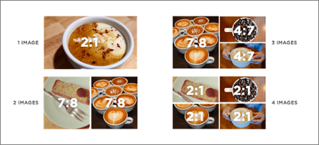
Image credit: Buffer
And here’s how multiple images look on desktop:

Image credit: Buffer
Stand Out With Something Creative
A single day’s worth of Tweets could fill a 10 million page book—there are a lot of tweets out there that are saturating feeds. Make sure your content stands out with a creative image, graphic, video, or motion graphic.
For example, try making a custom image to add additional context to the image and capture more attention. Tools like Canva or Venngage make those custom images easy—just remember to make them the correct size or your design may get cropped off.
Who’s doing it right? Wendy’s. Already killing the game with their witty brand voice on Twitter, they also make sure they stand out in news feeds with custom images, memes, video, and other media. For example, in the tweet below, Wendy’s makes a timely reference to Avengers: Infinity War while also taking a fun shot at their competition (McDonald’s). The end result is a tweet with viral potential and over 230,000 likes.

Twitter Image Specifications
Mobile Images: 1200 x 675 (16:9)
Mobile Multiple Image Upload
- One Image, 2:1
- Two Images, 7:8
- Three Images, 7:8 & 4:7
- Four Images, 2:1
Desktop Images: 506 x 506 (1:1)
Desktop Multiple Image Upload
- Two Images, 252 x 252 (1:1)
- Three Images, 337 x 337 (1:1)
- Four Images, 379 x 379 (1:1)
Video: 16:9 or 1:1
Facebook Social Image and Video Best Practices
Keep Videos Short and Sweet
More and more brands are creating more Facebook video as an average of 100 million hours of video are watched each day on the platform. Browsing through your own Facebook accounts, you’ll likely notice videos have taken over. Your eyes might be drawn to a video recipe from Tasty or a video from TechCrunch on the latest technology news.
To create Facebook videos that drive the best results, create videos that are between 60 and 90 seconds long. In a study that analyzed 100 million Facebook videos, Buzzsumo found that videos between 60 and 90 seconds had the most engagement on Facebook.
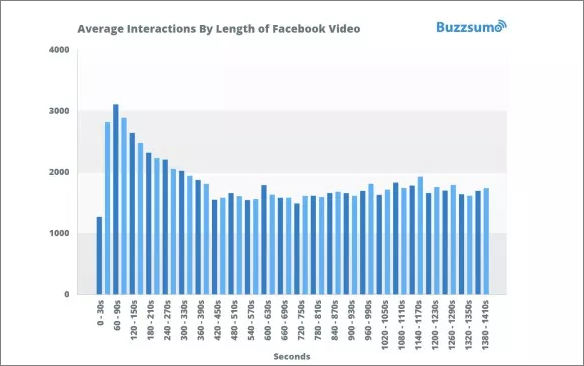
Image credit: Buzzsumo
When it comes to Facebook video, it’s also worth noting that 85% of Facebook users watch videos without sound. Any narration or audio you include in the clip might not make it to a majority of your audience. To ensure that your message is communicated to your viewers who prefer silence, add captions or copy onto your Facebook videos. This way both types of viewers get the full impact of your content.
Support Multiple Traffic Objectives With Carousels
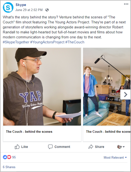
Oftentimes, social messages contain one link or call to action (CTA). However, Facebook is changing that with their new carousel page posts that can showcase multiple images, links, and headlines. As a collection of links and images, your Facebook followers can browse through your post to click on the link that’s most relevant to them. This makes carousels a great tool if you have a campaign with multiple landing pages or traffic objectives.
Who’s doing it right? Skype. While carousels make a natural fit for promoting several or even one product, Skype went in a different direction. Instead of promoting one of their software products, Skype is using carousels to share and generate awareness for their work with The Young Actors Project.
Facebook Image Specifications
- Image Uploads: 476-wide
- Vertical Uploads: 476 x 714
- Video: 1:1 or 2:3
- Image Previews From Link Post: 476 x 249
- Carousel Images: 300 x 300
- Cover Photo: 820 x 312
- Link-less Image Ratio (Paid): 16:9 or 9:16
- Linked Image Ratio (Paid): 1200 x 628
Instagram Social Image and Video Best Practices
Don’t Be a Square
Instagram used to only allow images with a square, 1:1 aspect ratio. However, they now allow for both horizontal and vertical image content. This can be done in regular image uploads, but also in Instagram Stories. So, don’t feel like you have to keep your images in those tight, perfect boxes. Use whatever orientation and ratio works best for the image you want to share. Here’s a great example courtesy of Buffer:
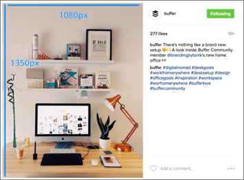
Image credit: Buffer
Drive Conversions With Stories
Instagram has been known to marketers for making it a little harder to share links. On Instagram, URLs and links don’t work in the description of traditional image uploads. As a result, many brands use their profile bio to add in a URL and update it for each campaign.
This is a good workaround, however, it requires a lot of additional clicks and steps from both audiences and social media marketers.
Instagram Stories, however, offer a better solution. Through stories, accounts with over 10,000 followers can attach a link to your post that audiences can visit by swiping up. This makes it easy to drive traffic to your target pages and drive more conversions. Plus, your audience doesn’t have to leave the Instagram platform to view the link—they can stay directly within the Instagram interface.
Don’t have 10,000 followers on Instagram? Getting your account verified will also do the trick.
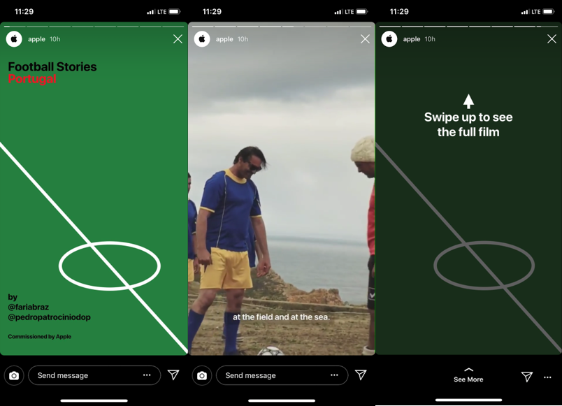
Who’s doing it right? Apple. Using Instagram Stories to tease their brand videos are captivating and engaging pieces of content. Taking advantage of both image and video, Apple knows how to pull people in and get them invested in a good story. To drive traffic to their objective pages, they’re also utilizing Instagram’s swipe up feature.
Instagram Image Specifications
- Square Image Upload: 1080 x 1080
- Vertical Image Upload: 1080 x 1350
- Horizontal Image Upload: 1080 x 566
- Video: 1:1 or 2:3
- Instagram Story: 1080 x 192
Size Up Your Social Campaigns
Social media is an important piece of any content distribution or promotion strategy. With each platform having a unique voice, purpose, and target audience for your brand, it’s important that you customize your social images and videos for each one. Whether that means customizing the image size, picking individual images for each platform, or creating a special video, the more you tailor your social imagery, the better.
Need help finding the perfect image for your content? Read our guide on how to find and choose dynamic images.If you’re ready to dive into the world of video, make sure you’re creating the right videos with our guide to the different types video for B2B marketing and when to use them.
The post Best Practices for Choosing Effective and Captivating Social Media Visuals appeared first on Online Marketing Blog – TopRank®.